Teams | Collaboration | Customer Service | Project Management

Latest Posts

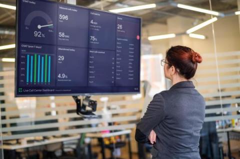
How to create a TV dashboard for Zendesk

When it comes to connecting with customers, Zendesk is a fantastic solution. From Sales teams to Customer Support, over 100,000 businesses rely on Zendesk to create seamless customer experiences. With Zendesk being such a fundamental part of many businesses' data stack, it’s not surprising that many wish to visualize their Zendesk metrics on a live TV dashboard. In this article, we’ll take you through our step-by-step guide to setting up a TV dashboard for Zendesk.

What is a data visualization dashboard?

A data visualization dashboard provides decision makers with a high-level view of their most important metrics. It combines numbers, charts, graphs, and other graphics designed to focus an audience on the metrics that matter. They can be helpful for spotting problems early, making decisions about where to allocate resources, and measuring progress over time.

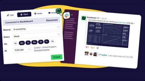
4 ways to generate Google Analytics reports in Slack

For the companies that use it, Slack is the business equivalent of mission control. The collaboration hub that connects everyone’s work – wherever they are. Much more than a messaging platform, the secret to Slack’s success is how easily it integrates with the tools businesses use every day. From popular collaboration tools like Google Docs, to automated alerts and notifications for thousands of niche and specialist products.

How to create a Google Analytics TV dashboard for GA4

Statistically, if you own or manage a website, you’re probably using Google Analytics. For countless business owners and marketers, Google Analytics is their go-to source for website performance data. Google’s dominance in the analytics world looks set to continue, even as it currently migrates its 35 million customers onto Google Analytics 4 (otherwise known as GA4 – the new version of its product) by July 1 2023.

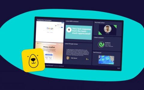
4 ways you can use our new Bannerbear integration to create even better dashboards

We recently shipped a new Geckoboard integration for Bannerbear. Why should you care? Because now you can generate snazzy images and graphics that display instantly on your Geckoboard dashboard. From live weather reports, to more engaging ways to visualize customer feedback, the possibilities are endless. And the best part is, you can automate the entire process, end-to-end. What is Bannerbear?

Conversion Rates & Purchase Funnels: 6 Mistakes to Avoid

In marketing and sales, purchase funnels form a crucial part of how we view the customer journey. And the most common way of measuring the effectiveness of a purchase funnel is with conversion rates. Conversion rates provide a temptingly simple way of measuring how successful each of your tactics or touchpoints has been in moving the customer along – one step nearer to that all-important final stage – the sale.

Anscombe's Quartet - why summary metrics lie

In business, we use summary metrics all the time. A summary metric is just another way of saying you have summarized a series of data into a single data point – like a total or an average. Most of the time, when you report on business KPIs like Revenue, Customer Satisfaction, Acquisition Cost, or Lifetime Value, you’re doing so in the form of a summary metric. But summary metrics can be misleading, because they reduce complex patterns in your data down to simple, singular figures.

How Customer Service Management Benefits Boost Your Business

Customer service management (CSM) software can provide an exceptional customer experience, eliminate manual processes, give you a competitive edge, and increase growth through renewals and retention But choosing the right solution for your business can be challenging as most providers offer very similar features. Below, we explore the benefits of Customer Service Management software to help you choose the best CSM solution that fits your business needs.