Teams | Collaboration | Customer Service | Project Management
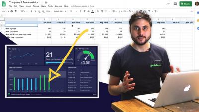
Spreadsheet dashboards with Geckoboard - how to get key metrics seen!
9 dashboard design principles: see them in action with real examples
Dashboard design principles are all very well, but what do they look like in practice? This blog will walk you through nine golden rules, with a real-life dashboard example for each. By following these simple steps you can create a dashboard that's clear and effective. And you don't need to be a designer to make yours look great. Enjoy building!
Behind Geckoboard's new brand
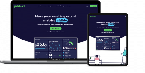
You may have noticed that things are looking a little different around here, as we’ve made the biggest changes to our brand and product since we launched over a decade ago. Our old brand: There were several motivations behind the rebrand. Firstly, our visual identity was inconsistent. We’d last rebranded back in 2014, and since then our look and feel had moved on, but in an organic and un-codified way.
Geckoboard Speed Run: Building a Support Dashboard in Under 7 Minutes With Zendesk Support
Dashboard Speed Run: Building a Customer Support Dashboard in Under 5 Minutes
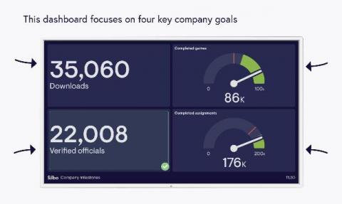
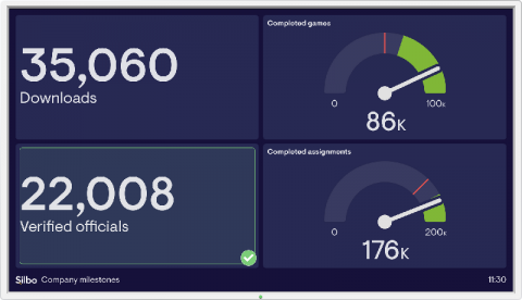
5 dashboard examples with very different approaches for tracking company performance
As your company grows, and departments become more specialized, teams can lose sight of overall performance. A dashboard is a great way to present the “pulse” of your business, and keep your team in the loop. Plus, it saves you from creating reports, which are often overlooked or out of date by the time people read them. But what aspects of company performance should you and your team be tracking?


